A RETROSPECTIVE HANDWRITING FONT
Quite a while ago I came across a few old fashioned handwriting-style fonts that caught my attention. I started collecting all sorts of script types from logos, packaging and commercial typefaces.
Pretty soon I decided to create a typeface in that style myself. The result is a stylistic mix between handwriting and letterset type. Designed for headlines, labels and lettering.


INSPIRATION & STYLISTIC APPROACH
After a while of comparing and analysing these typefaces I solidified specific aspects I liked about each piece and formed an idea
in my head. After my first font only consisted of capital letters I decided to go a bit further and create a full letterset this time.
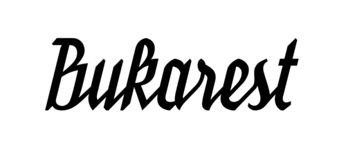
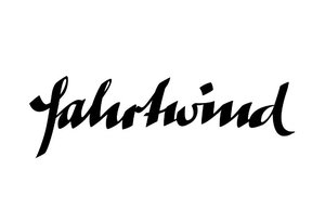
Examples:
The font should:
consist of connected letters


have a calligraphic brush ductus
with heterogene strokewidths.

be italic


have a consistent and homogene look.

remain spikes like blackletter fonts or graffiti.
Feel rather hard and not too playful.


SKETCHING
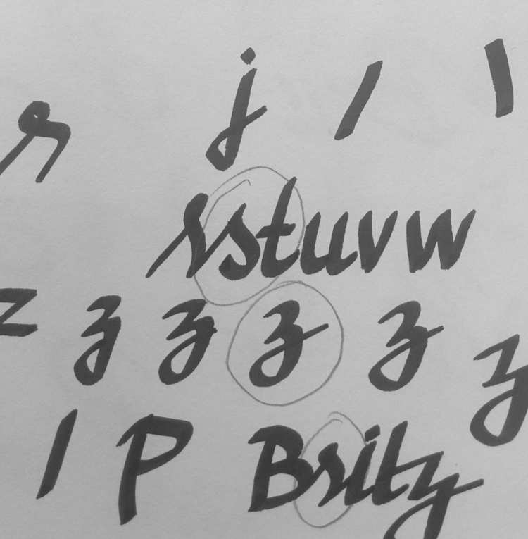
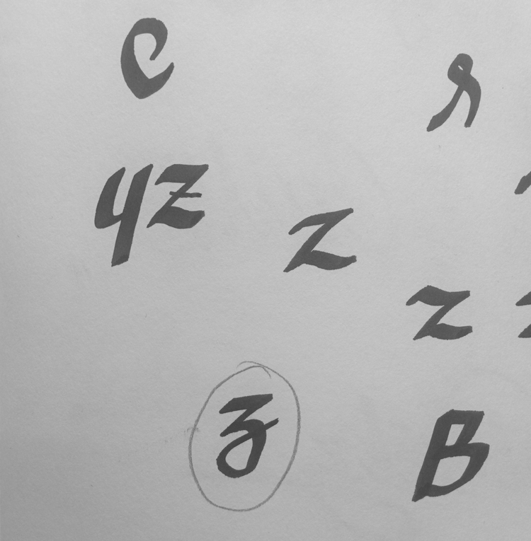
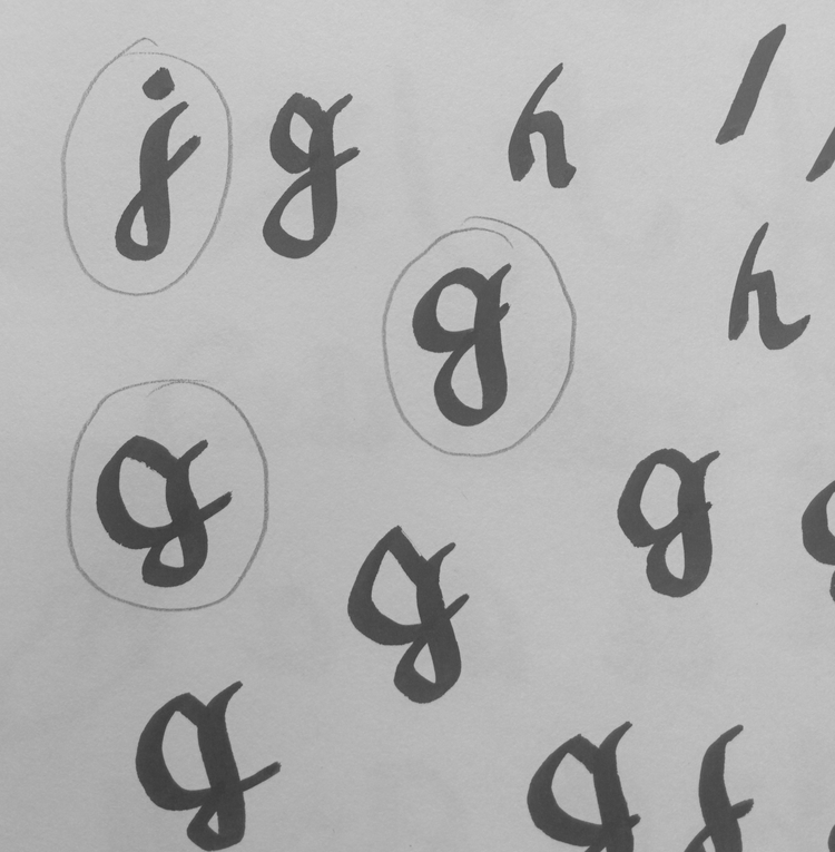
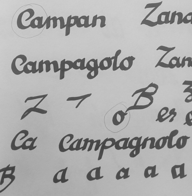
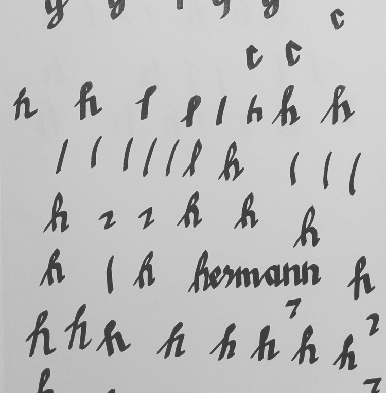
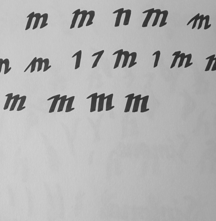
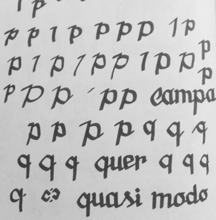
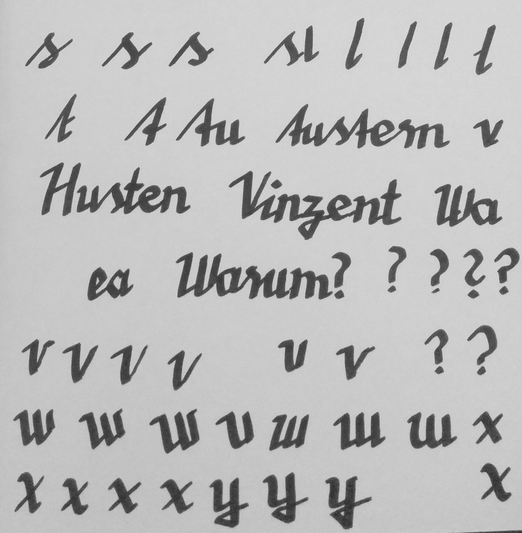
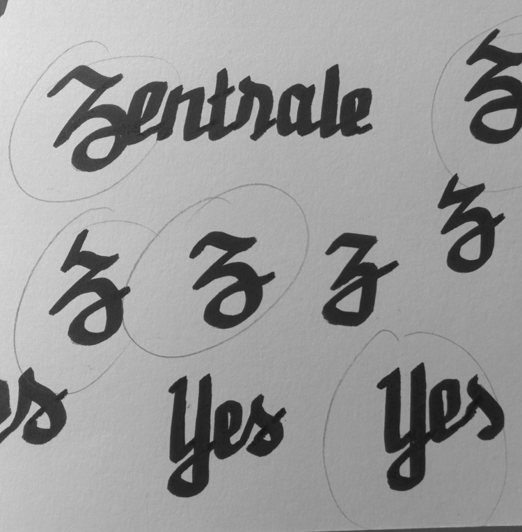
I bought a calligraphy pen and started scribbling loads of characters.
I scanned the ones I liked and traced them in Adobe Illustrator.


MAKING THE FONT
I decided to continue with Glyphs App to have a nice tracking and kerning, while keeping all pairs of letters seamlessly connected. This was a quite intense and time consuming process.
ORDER THE CHAOS
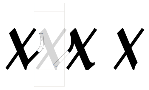
The font shouldn't look like actual handwriting, but more like a stylised, straightened version of it. It also should go with a large x-height and a condensed character. Therefore I created a grid which the letters got integrated in.


DETAILS
numbers, diacritics, punctuation and ligatures


MORE DETAILS
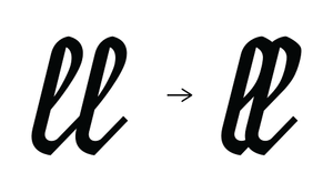
Some character combinations looked weird so I started to create positional alternates
(initial, medial, terminal and isolated).


NEVER ENDING STORY
Working on this font for more than two years, seemed like becoming a never ending story.
I could have easily reworked all letters again and again, but at certain point I decided to finalise the font and share it with the world.
